At-A-Glance
‘Bear Brews’ is a local coffee shop with a basic, limited functionality mobile app. Due to this, its users often find themselves frustrated with a confusing interface, slow ordering process, and lack of personalization. The current app is usually abandoned and set aside for ordering in person. Cub’s Cafe needs a more user-friendly, feature-rich app to enhance their customer’s experience.
My Role
Product designer, User researcher, UX,UI Designer
Timeline
Aug 2023- November 2023

Tools
Figma, Adobe Illustrator, Adobe photoshop
Brewing Connections
Bear Brews is a small, local coffee shop competing with major brands. To keep up, a mobile app was needed to provide competitive factors such as ordering ahead, “earning points,” and push notifications to customers.
Solution
Design a mobile app that meets the goals of the business and users
Branding that shows Cub’s personality and establishes a unique presence.


Personalization

Digital Menu
Introduced interactive digital screens for faster ordering.
Suggested drinks and bakery items based on past orders to enhance upselling.

Points-Based System
Customers earn points for every purchase, redeemable for free items.
-
Identify Cub’s target audience
Establish a competitive analysis and address strengths and weaknesses.
Comprehend Market trends of similar businesses.
Study user’s experiences with the online platform.
Address pain points encountered within the Mobile App
-
Local Residents: Coffee lovers who live or work nearby and visit the shop frequently.
Busy Professionals: People who want a quick, efficient ordering process.
Students/Young Adults: Those looking for a casual space to work or hang out.
Loyal Customers: Customers who value loyalty rewards and personalized experiences.
-
Throughout the interviews, I aimed to ask open-ended questions to hear from our users and to identify their needs. I conducted interviews with five people, about 15 minutes each. Here are a few questions I asked:
How often to you go out for coffee?
Do you prefer local businesses or chain?
What do you look for in your morning coffee run?
What type of atmosphere would you find most appealing?
Competitive Analysis
I examined mobile apps from other local coffee shops and national chains like Starbucks and Dunkin’ to identify strengths and weaknesses.

Key Takeaways
Starbucks: Strong loyalty program, personalized recommendations, and mobile payment integration.
Dunkin': Simple and fast ordering, clear promotions, and rewards tracking.
Local Competitors: While some competitors had nice interfaces, they lacked advanced features like personalized offers or integrated payment methods.
Task Flow

Information Architecture

User Flow

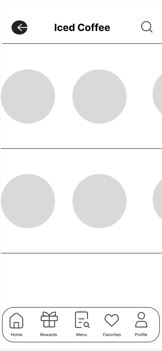
Mid-Fidelity Wireframes


Logo and Visual Design

#513323
Brand
#2C4D74
Accent
#EDE9E4
#F9F9F9
Neutral
#212121
Neutral
Neutral
Typography

-
I created interactive prototypes in Figma and conducted usability testing with real users. Users were asked to complete key tasks, such as placing an order and navigating the menu.
Positive: Users loved the simplified ordering process.
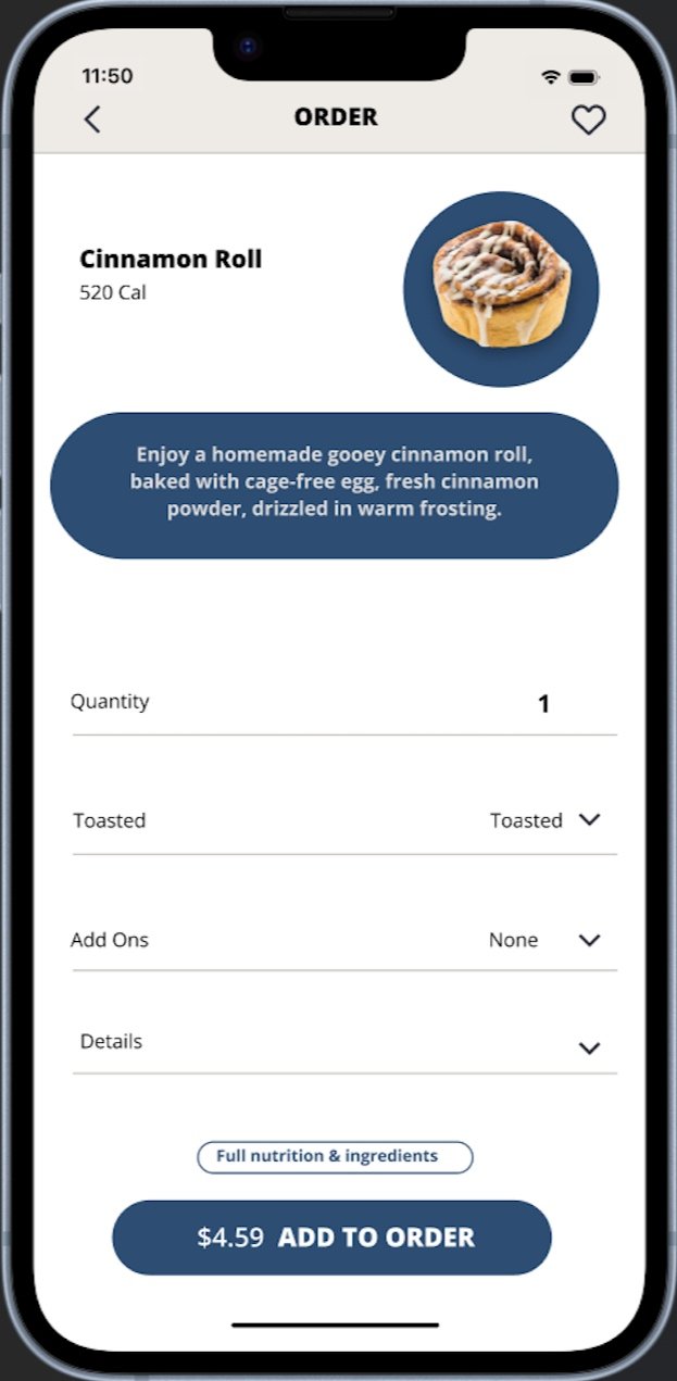
Pain Points: Some users found the item descriptions a little too crowded.
Suggestions: Some users requested a "favorites" section where they could save their go-to orders for even faster reordering.
-
After refining the wireframes and incorporating feedback, I finalized the design for the app with a vibrant, modern interface with easy navigation. I also included enhanced features like order tracking, rewards visibility, and a favorites tab.
-
User Satisfaction: Post-launch surveys showed an improvement in user satisfaction, with most users rating the new app as "easy to use" and "visually appealing." Simplicity is Key: The more straightforward and intuitive the process, the better the customer experience. Avoid unnecessary steps that could frustrate users.
Rewards Drive Engagement: A well-implemented loyalty program can increase repeat visits and foster a sense of community.
Performance Matters: A smooth, fast app experience is crucial for retention. Slow apps can drive customers away.
Feedback Loop: Continuous testing and feedback are essential for refining the user experience over time.

